Blogs

Art + Commerce = Advertising?
05 Feb 24
By Owner
Time : 458 days 22 minutes 17 seconds ago

Allow us to punctuate this marketplace of ideas with an examination on the dynamic between art and commerce. Visualise this–the divine feminine occupies your plane of vision.
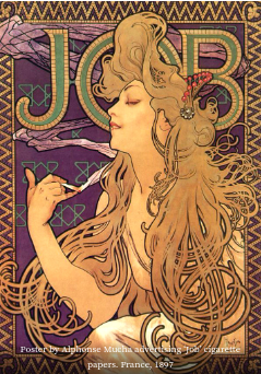
Allow us to punctuate this marketplace of ideas with an examination on the dynamic between art and commerce. Visualise this–the divine feminine occupies your plane of vision. She is dressed in red, flowers are intertwined in her voluminous, curvilinear riptides of tresses that fall in ever-so-graceful cascades alongside an avalanche of cloth. Bound in rapture by a seemingly inconspicuous parchment, she introduces you to a newfound appreciation for the subtle fragrance of liquorice lingering in the air, drawing your gaze to the letters ‘J.O.B.’
Conception of the Commercial Arts:
The above description may lead too many to believe that you’re at an art viewing, but in truth, it’s a salon gathering in early 20th-century Europe. What caught my attention is not a painting but an advertisement for “JOB cigarette rolling parchment,” made by none other than Alphonse Mucha.
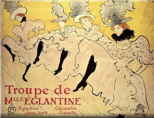
While Art Nouveau originated as a reaction against academic art and industrialization, its roots delve into the profound impacts of global trade and technological advancements on Europe. Drawing inspiration from nature, the movement aimed to imbue daily life with beauty through sinuous lines, organic forms, and intricate details. As the collective aesthetic evolved, the market adapted to cater to this emerging niche. Beauty became not just a product but a method of presentation. This era witnessed commissioning of artists for the creation of posters and advertising materials, reflecting the demand for artistic expression in everyday commodities. We bear witness to the marriage of art and commerce, this was the inception of western ideals of graphic design in the womb of Art Nouveau. While most conversations on design make an instinctive turn of the head towards modernism and Bauhaus, Art Nouveau doesn’t seem to get as much consideration. This is perhaps because of its visually grandiose, ethereally utopian outlook towards beautification, which was taken over by the more linear and pragmatic. The shift also very likely owed much to the volatile terrains of politics and the rapid transformation of global philosophies and values that thus ensued. However, it would be profoundly foolish to not acknowledge the impact of this movement in the global design landscape that has trickled down into the forthcoming centuries.
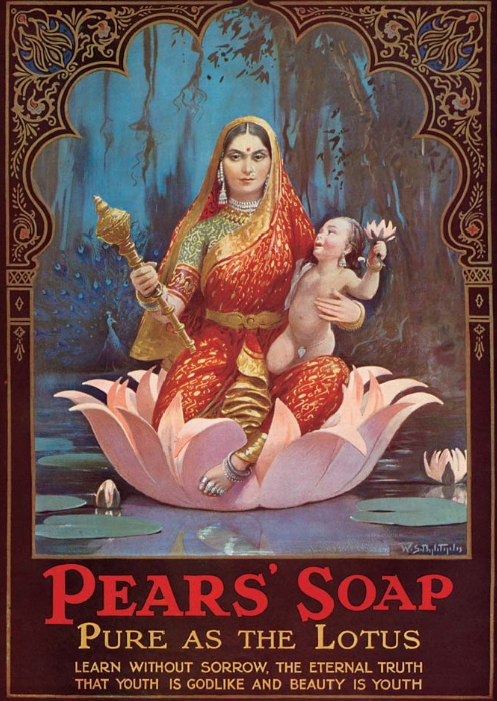
In Bombay, India, alongside the nascence of Art Nouveau, around 1894, a lithographic press was established by Raja Ravi Varma. Varma’s prints combine his aesthetic and philosophic knowledge of European academic art with Indian sensibilities to produce symbolically charged artworks replete with iconography, often centred around divine women and mythology. With the invention of the press, works of art that would otherwise restrict themselves to institutional constraints are now widely available to the public. Art and divinity broke their perceived shackles of merely belonging to temples, museums or galleries, and these prints found themselves on calendars, magazines, posters, and matchboxes, bringing emphasis on mass production and commercial viability. Gods and art were now found in homes.
In the 1960s, the currents of Art Nouveau were revitalised in the form of psychedelic and pop art. It was like seeing the throbbing elements of Art Nouveau—the engaging female figures, the detailed two-dimensional illustrations that filled every inch of the artwork—through the lens of a radically contrasting colour palette. Psychedelic concert posters became artworks in their own right, with fans sometimes snatching them up for their private collections immediately after they were put up. For an advertisement or poster today, such obsessive enthusiasm would seem unimaginable to garner. Further, rebelling against elitist values and the self-reflexive expressionist movement, pop art embraces banal living experiences, introducing familiar mass culture imagery and bringing art closer to the new generation of Americans. Andy Warhol, the legendary pop artist known for his iconic Campbell’s Soup can portrait, was an avid advertising proponent and sought to challenge the very understanding of what art is. Sometimes it can take an artist’s eye and a bold black outline to make evident the beauty in the mundane.
On the one hand, pop art elevates the products of mass culture and consumerism to the status of fine art; on the other, we also see examples of the opposite, where art, divinity, and philosophy, at their pinnacle, descend from their high-walled shrines to reside with “ordinary mortals”. The commonality here is the involvement of art as a proponent of commerce, blurring lines between commodification and works of aesthetic profundity. The West wasn’t alone in this ethos.
Art-Commerce Continuum
ast forward today, and the innocently simple mascot of Amul and the catchy jingles of Nirma are just as ingrained in our memories as any iconic painting of Raja Ravi Verma—perhaps more firmly so. Just like artwork is more than the paint, clay, or marble that it is made from, advertisements are much more than the products they appear to be selling. I use the word ‘appear’ because, really, who remembers the ‘Mentos’ ads for their mediocre mouth-freshening candies? The minty freshness is a metaphor for bringing about positive change through simple actions—far too deep a philosophy than should be confined in the little plastic wrapper. Irrespective of how many people actually buy the product after seeing the advertisement, it creates a subconscious impact and alludes, however satirically, to the social issues at large, reaching a much wider audience than conventional art enjoys.
With such powerful examples and gold standards to look up to, most advertisements today must take a second look at their smug adherence towards pragmatism, the so-called fix with linearity, and the near renunciation of artistic beauty. While art in advertising is often equated with superficiality and excessive pomp, denying its place by that factor alone is naïve and thoroughly lacking in nuance. Subsequently, the aesthetics vs. utility argument treats the two as separate entities, often placing the latter on a pedestal and giving the former a contemptuous secondary stature. A compromise of this nature results in an impaired visual dialogue stripped of intellectual dimensions. In our rational considerations, isn’t it possible that we may have neglected the utility of beauty?
Co-Authors: Annyesha Bhuniya, Harini Srinivas
Copy Edited: Harini Srinivas


CP
February 23, 2024 at 5:59 PM
Very insightful !